Seamless Employee Onboarding
Creating a cohesive and connected onboarding ecosystem for both employees and employers!

Creating a cohesive and connected onboarding ecosystem for both employees and employers!

Many users do not know how to effectively share their fundraiser link, leading to fewer visitors and donations. Without clear guidance, shares are less successful, limiting the fundraiser’s reach and impact.
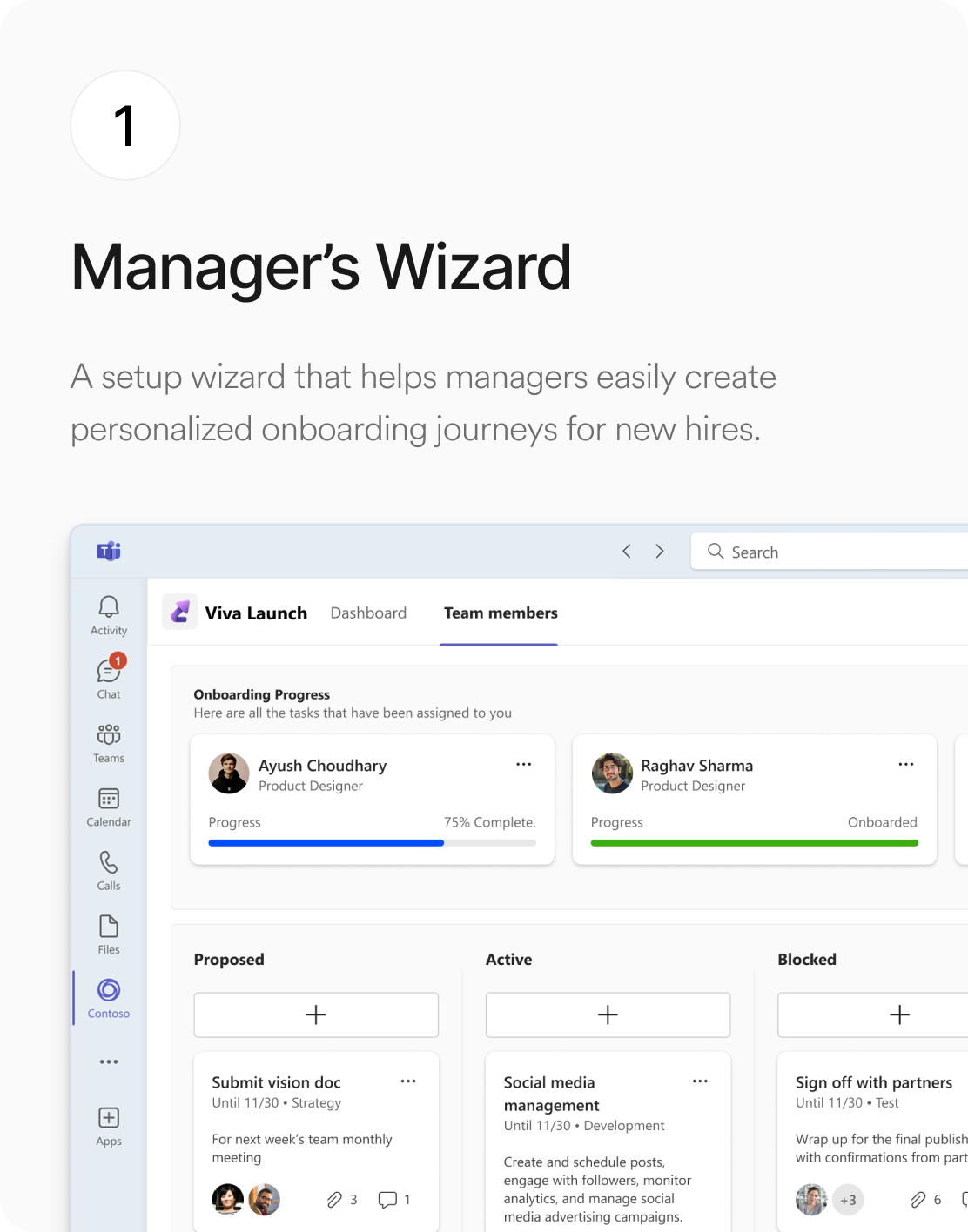
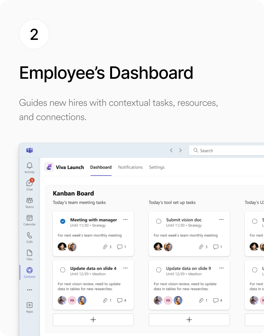
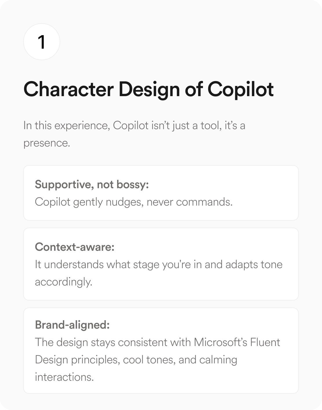
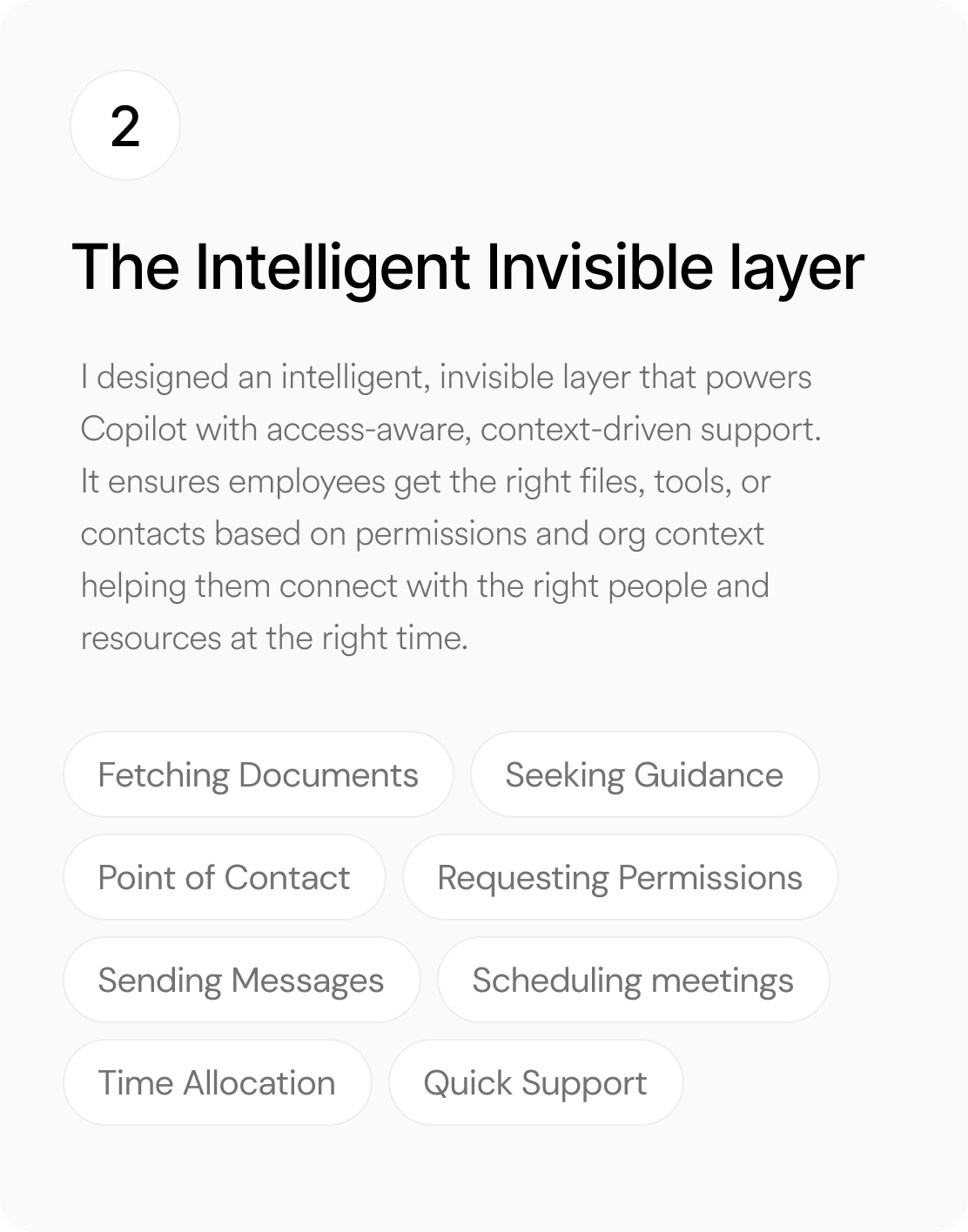
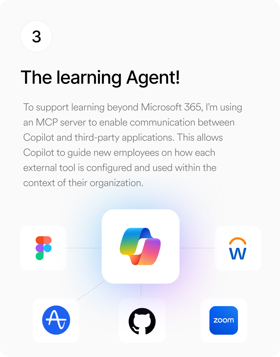
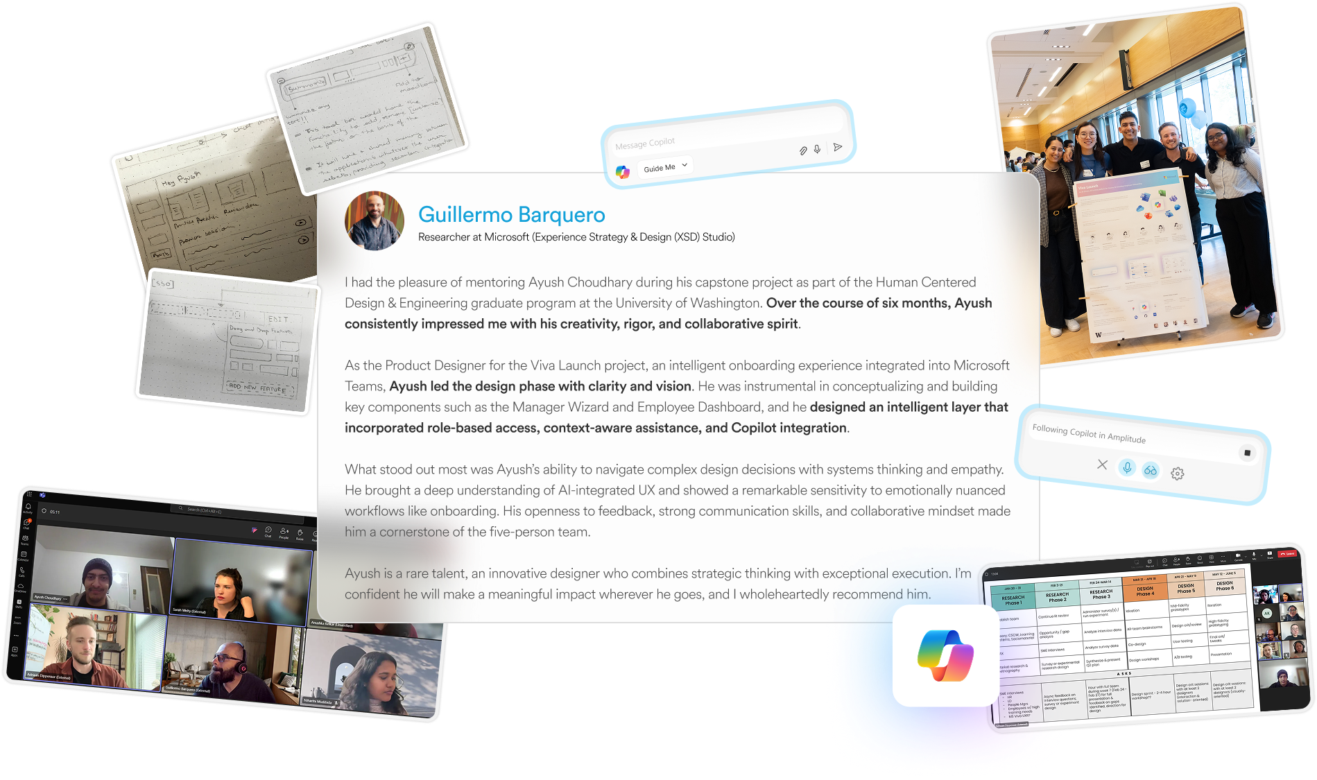
Onboarding is often treated as a checklist rather than a meaningful experience, leaving new hires disoriented and managers overwhelmed. Viva Launch, designed in collaboration with Microsoft’s Strategy, Experience, and Design Studio, reimagines onboarding as an AI-integrated, guided journey within Microsoft Teams. It combines an Employee Dashboard that surfaces tasks, documents, people, and learning in context with a Manager Wizard that simplifies setup and personalizes the onboarding experience for each new hire.
My role
Product Designer
Duration
6 months
Tools Used
Figma, V0 (prototype coding),
Clickup,

Through 12 In-depth Interviews, Market Research & Netnography, we gather qualitative insights from Employees, Managers and Subject matter Experts. These are the primary problems that new hire employees face.
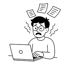
The Firehose Effect
Too much info on day one overwhelms new hires, causing stress and making it hard to remember what they learn.
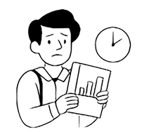
Pressure to Perform
New hires feel rushed to perform quickly, leaving them with little time to truly learn and adapt to their new role.
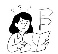
Disorientation
New hires are unsure where to find information, who to ask, or how to navigate unwritten norms and team dynamics.
Under Resourcing
There’s usually limited guidance and poor documentation, leaving new hires to figure things out alone.
Nervousness
New hires often fear being seen as incompetent, which makes them reluctant to ask questions or take initiative.
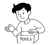
Struggles with IT
New hires struggle with technical setup, managing access, and figuring out permissions without clear guidance.


Many users do not know how to effectively share their fundraiser link, leading to fewer visitors and donations. Without clear guidance, shares are less successful, limiting the fundraiser’s reach and impact.
A link to the fundraiser is the most important aspect of a share. The link (fundraiser URL) is what enables viewers of a share to seamlessly visit GoFundMe and learn more about the fundraiser and ideally convert.
Guiding users on how to share the fundraiser link will significantly increase successful shares and the visitors per share for this method. The educational workflow will also benefit other upcoming projects that will need to utilize downloading of assets and uploading tutorials, such as image sharing and videos, meaning the project will make an even further impact down the line.
My role
Product Designer
Duration
7 weeks (7th July - 17th August)
Tools Used
Figma, Amplitude, Google Suite
I would love to share more! Please email me at choudharyayush891@gmail.com for more details!
GoFundMe's design team is divided into 3 departments; I was part of the Amplification Team, which is responsible for taking an organizer’s fundraiser to as many people as possible. One direct way of achieving this is sharing the fundraiser with as many people as possible.

To conduct this study, we utilized a remote A/B testing approach, supplemented by the System Usability Scale (SUS) questionnaire and qualitative assessment.
To conduct this study, we utilized a remote A/B testing approach, supplemented by the System Usability Scale (SUS) questionnaire and qualitative assessment.

Inconsistent Flows
The user flows that took our users from their fundraiser page to any social media platform had multiple points of friction, which created drop-offs.

Balance between the users
We had 2 categories of users, power and inexperienced users and to come up with a way that teaches inexperienced users and does not create friction for a power user was challenging

Dependency on social media Platforms
We were completely dependent on the social media applications and the way they functioned and were constrained.
